Etsy had a major rebrand ready to move — and the design systems team was deep in the work but struggling to get it across the line. Pixelfat was brought in as a specialist contributor, helped diagnose what was creating friction, and worked alongside the team to build the clarity and structure needed to move forward.
The challenge
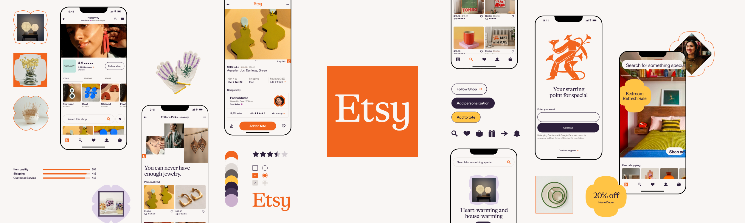
Etsy's design systems team was in the middle of a significant rebrand — translating a new visual language developed by an external agency into the product design system. The work was complex: touching color, typography, spacing, elevation, and 100+ components across mobile and web. Progress had slowed, and it wasn't immediately clear why. Pixelfat's first job was to understand the problem before trying to solve it.
diagnosing the friction
After embedding in the team's workflow, we identified where momentum was breaking down — unclear ownership, decisions getting re-litigated, and guidelines that hadn't yet been translated into product-specific rules that designers could actually act on. The path forward wasn't a single blocker; it was a set of compounding ambiguities that needed to be resolved in the right order.
"Jennifer at Pixelfat really helped us get through some major milestones on our refresh and design system and wore so many hats throughout the process."

— Jackie Ngo renner, senior staff product designer, Etsy
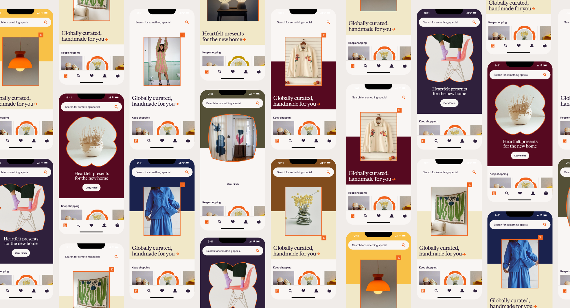
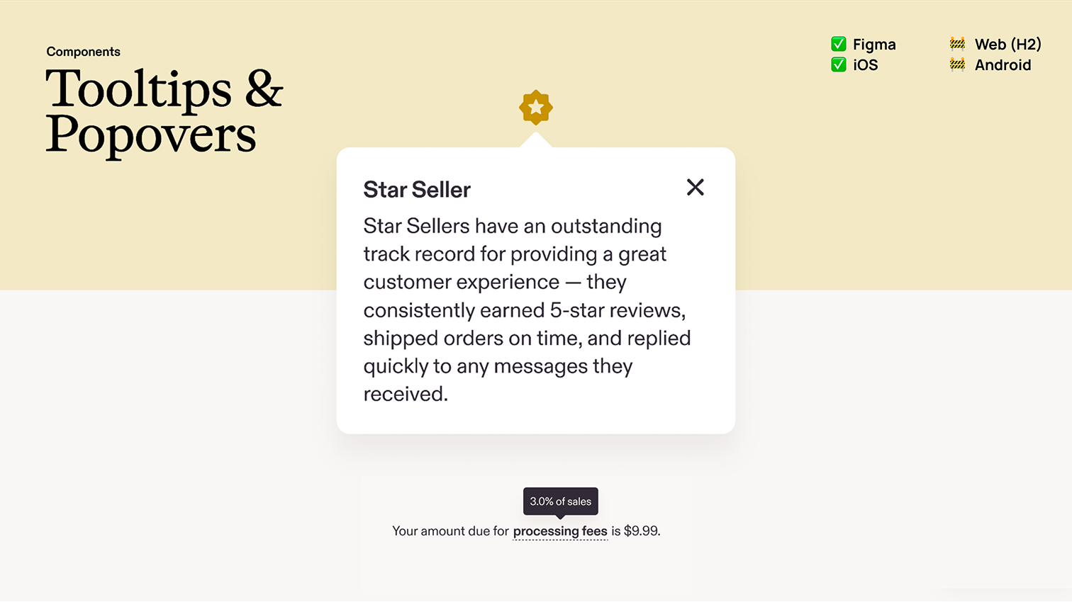
Translating Brand Into Product Rules
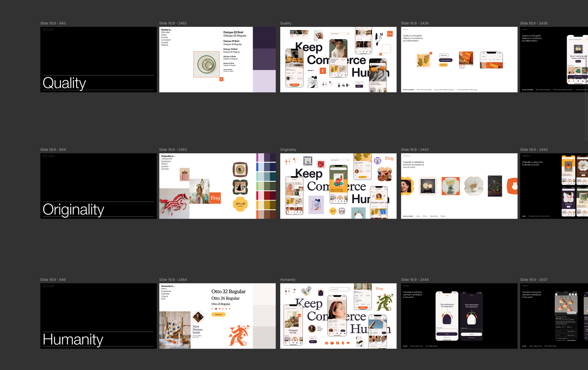
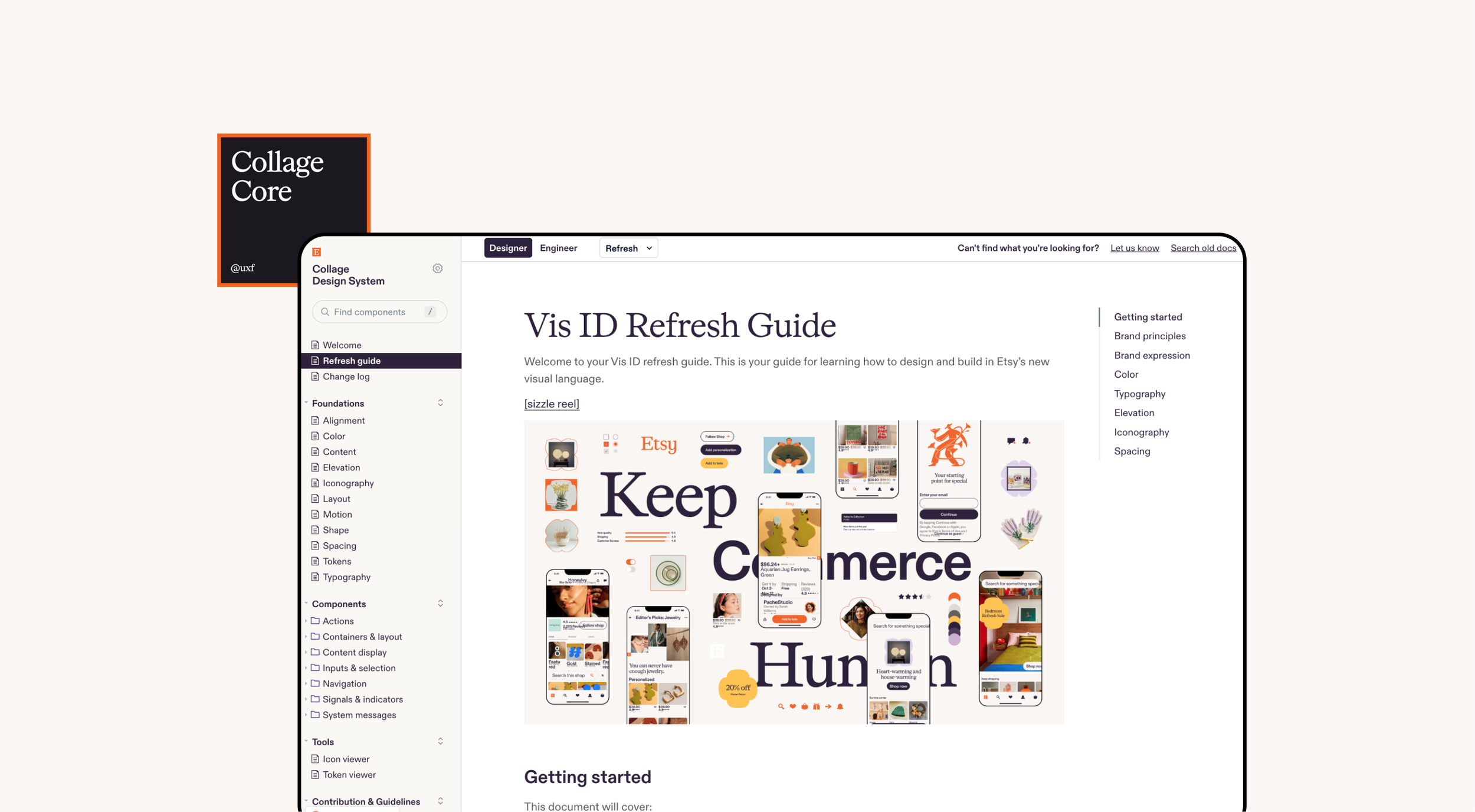
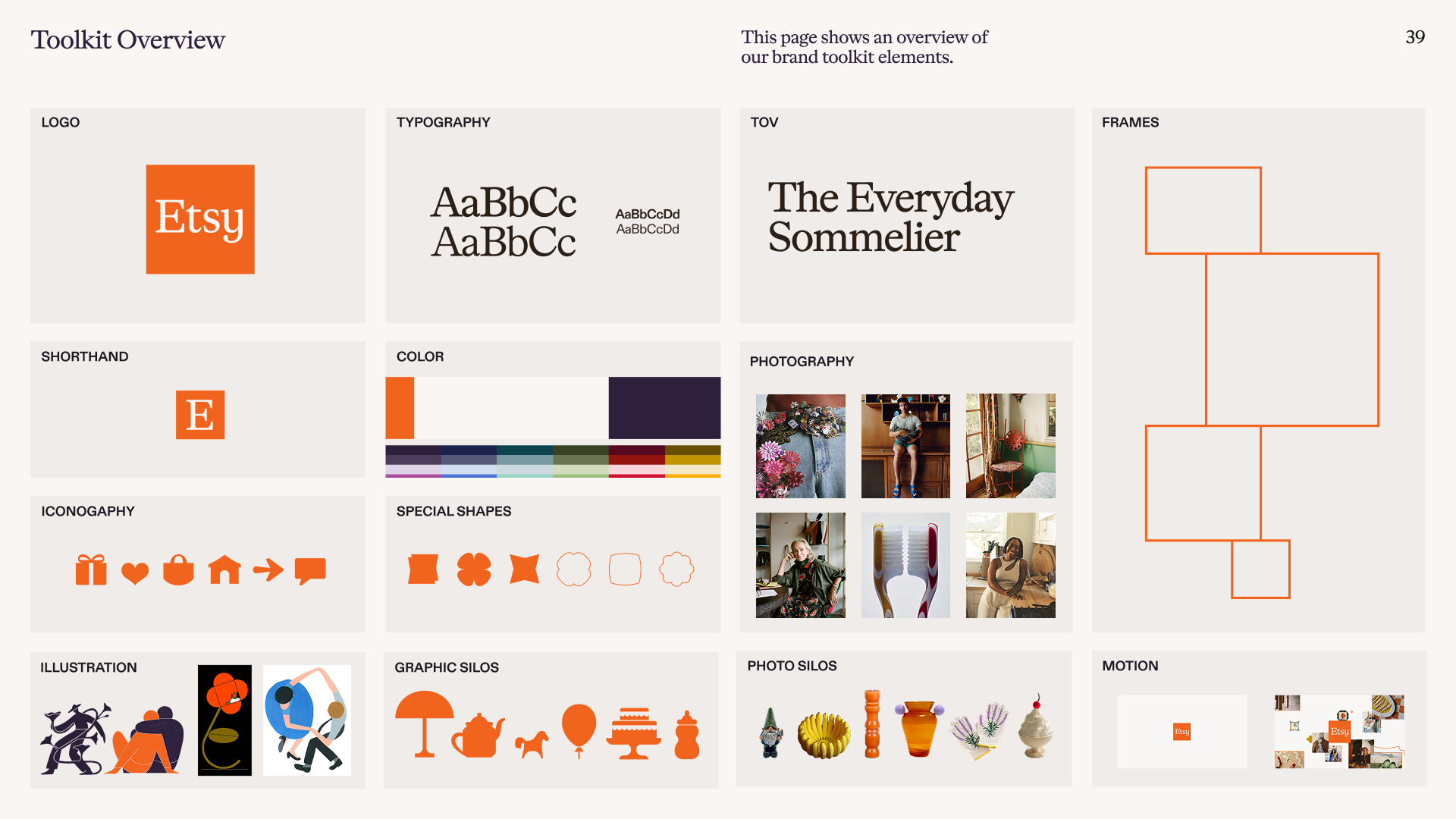
A key gap was that high-level brand guidance hadn't yet become actionable product documentation. Pixelfat took ownership of this — authoring guidelines that translated principles like color restraint, typographic hierarchy, and elevation into specific, usable rules for product designers. These guidelines covered how to dial brand expression up or down depending on context.
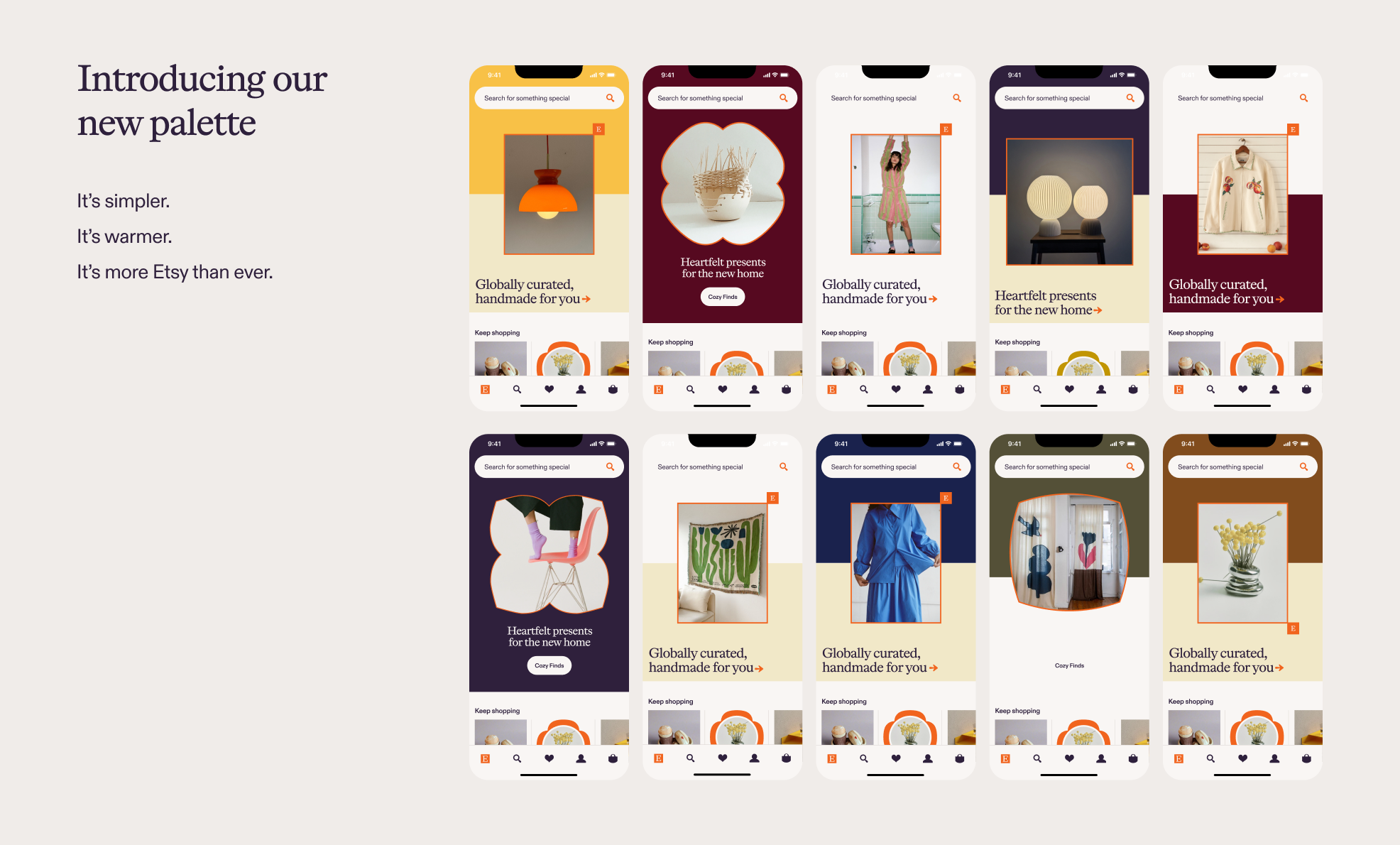
Enabling the Product Org
With guidelines in place, the team was able to move. Pixelfat helped coordinate the content, structure the communications plan, and deliver the new visual language guidelines to the broader product org at an org-wide onsite — giving 50+ designers what they needed to start designing in the updated system with confidence.
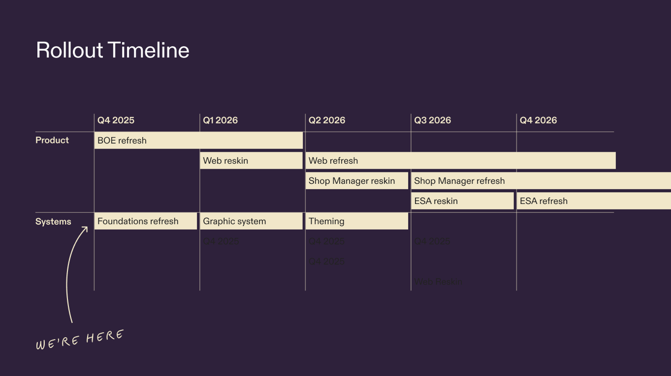
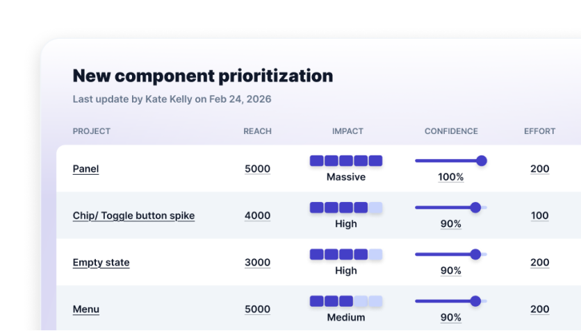
Component Strategy & Prioritization
Following the rebrand release, the engagement shifted to strategic component build-out. Working with the product manager and engineering director, Pixelfat helped determine which components to build, in what order, and why — applying RICE prioritization to balance design quality, engineering feasibility, and product surface coverage across mobile and web.
Governance That Outlasts the Engagement
One of the most durable contributions was introducing the first formal governance and intake process for design system requests. Before this, there was no standardized way for the broader product org to request work from the design systems team. The new process gave the team a clear, repeatable system for triaging and communicating work — an operational foundation that continues beyond the engagement.
The outcome
The new visual language guidelines reached the full product design org, unblocking work across mobile and web surfaces and giving designers the tools to build confidently in the updated system. Component library coverage reached 65% across 80% of major mobile surfaces. Beyond the immediate deliverables, the design systems team came out of the engagement with clearer operating rhythms, better stakeholder visibility, and a governance model built to scale.

More case studies
Nextdoor: Your local neighborhood design system

Coffee Meets Bagel: Helping people make a genuine connection

OMGyes: Using design to understand the science of sex

Plangrid: The power of collaborative user testing