
Autodesk
Using research to drive Design
Pixelfat collaborated with Plangrid (an Autodesk company) to create Project Hub — a dashboard that would help users navigate project data with confidence.

The Client
Used on over one million projects around the world, PlanGrid is the first construction productivity software that allows contractors and owners in commercial, heavy civil, and other industries to work and collaborate from anywhere.


What they do
Construction is incredibly complicated. A typical project requires dozens of trades and they all need to coordinate on the same drawings, processes and forms.
Traditionally, all this coordination involves countless physical drawings that continually have to be updated, copied and distributed.
With Plangrid, all that information is shared in the cloud, making for a dramatically more efficient workplace.
“Pixelfat’s collaborative approach, humbleness, and design expertise are the reason I recommend them to other companies.”
— Alissa Briggs, Director of Design, Construction at Autodesk
The Challenge
Plangrid wanted to create a time saving dashboard that would surface customer data in the smartest way possible. To that end, Plangrid created a cross-functional internal team to build Project Hub and they partnered with Pixelfat to lead the design initiative within this team.
The goal of Project Hub was to intelligently group and surface data in a meaningful way for their customers. But, of course, this was easier said than done. For one thing, there were many different types of users on Plangrid, and they were all looking for different information.


Research phase
This project was high stakes for Plangrid. It would be relatively costly to be build, and would be the first thing all of their users would see when they entered the app.
Obviously, the team wanted to get it right and not waste time and money building something that wasn’t going to make Plangrid users lives easier and more efficient.
In order to accomplish this, we set out to understand our users…guerilla style. With nothing but a GoPro, the team visited several construction company offices over a couple weeks . And we asked them one primary question: what data do you need to do your job?
Research synthesis
After all that research, we had a lot of information…and we needed to synthesize it. But rather than get bogged down with questions about UI too soon, we stayed focused on content strategy, sticking to pen and paper before jumping into pixels.

All about that A/B
Once the team felt like they had a pretty good grasp on who our ideal customer was and what data they needed, it was time to test our assumptions. We created two different prototypes and tested them with a large variety of customers; large, small, general contractors, sub contractors, in the office and on the field. Users were able to compare and contrast both prototypes, and, over a series of interviews, we were able to identify a few critical trends.
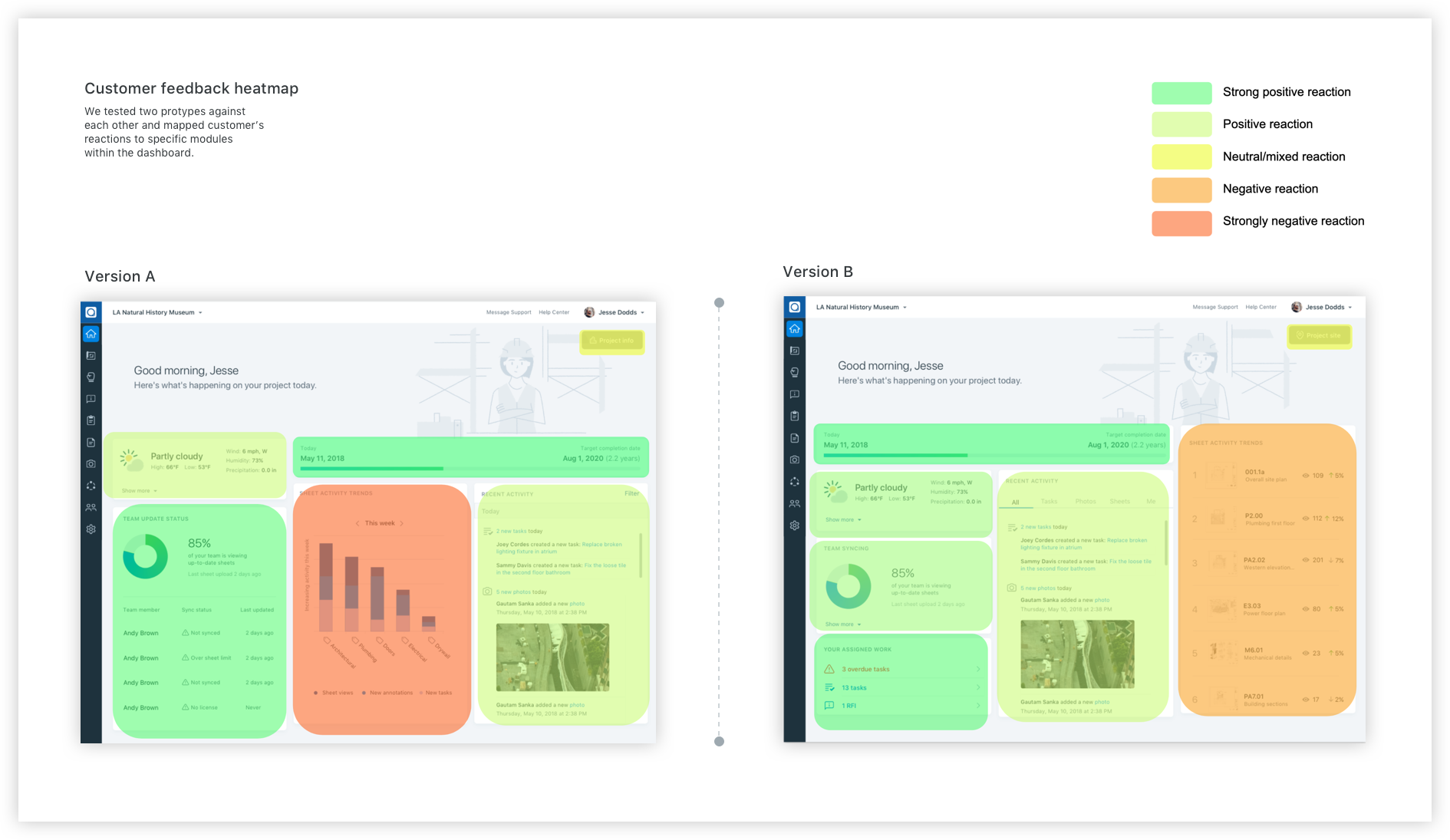
Hard choices
Balancing the prototype feedback against the cost of implementation and business objectives; we made some tough prioritizations. We landed on a final design. Built that design. Then released the build to a carefully selected customer group who had volunteered for the beta version .

The Results
Overall, we saw user engagement increase. Instead of digging through long lists of data, users accessed relevant information directly from the dashboard. Perhaps more tellingly, qualitative feedback was demonstrably positive. Users loved the new feature, and they let us know. In fact, the beta release went so well, Plangrid decided to enable the feature for 100% of their users shortly after.

“You can’t see me but I’m happy dancing over here.”
-Customer (Becky Oden-Hardy GC)
More case studies

Collective Health: Building a design language system

Coffee Meets Bagel: Helping people make a genuine connection

OMGyes: Using design to understand the science of sex

Plangrid: The power of collaborative user testing