Coffee Meets Bagel
Reinvisioning online dating
The Client
Coffee Meets Bagel is a multi-million dollar dating app, founded and run by three sisters. Together they set out to create a dating app that was different from the rest—one that aimed to create authentic connections by focusing specifically on the dating experience of women.

The Brief
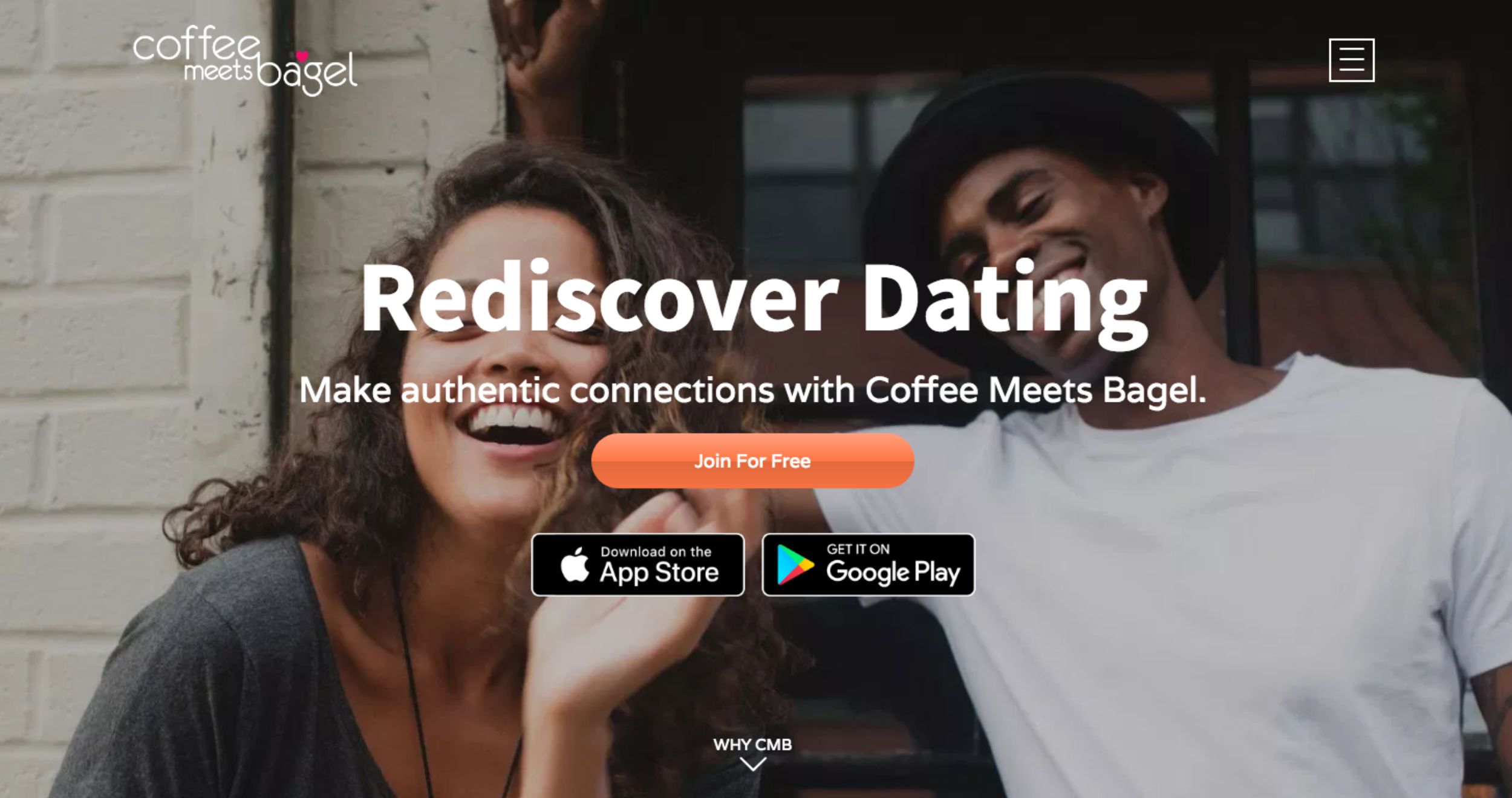
After six years and 215 billion romantic introductions, Coffee Meets Bagel had a loyal fan base that considered CMB the app to use for more ‘serious’ daters. However, CMB wanted to further refine their brand by rethinking their mobile experience. Pixelfat Design worked with CMB to redesign their iOS app, start a design language system and introduce design processes that would lay the foundation for more efficient implementation.

“When there’s chemistry, great things can happen. But sometimes people need a little push. That’s where we come in.”
— Carly Macintosh, CEO, Coffee Meets Bagel

The Process
To redesign the CMB iOS experience we followed a specific design process to ensure that we produced the best results within the least amount of time and expense. At Pixelfat, we believe that good design doesn’t have to be mysterious, and laying out our process ahead of time helped get everybody on the same page.
Understanding the Problem
Before jumping into pixels, we like to do our homework. After all, it’s almost impossible to come up with a good solution without first understanding the problem. We begin this process by first understanding CMB’s competitive landscape and brand values. In other words, what is everyone else doing in the online dating world and how does CMB break away from the pack?


Initial Explorations
Together, we created three visually distinct design directions. We first started to visualize those design directions by creating moodboards—collections of photography, screen interfaces and type treatment.

Defining the Directions
We further defined the three directions by translating the moodboards into style studies—documents that exemplify how a visual mood might translate into UI elements.


Landing on a Solution
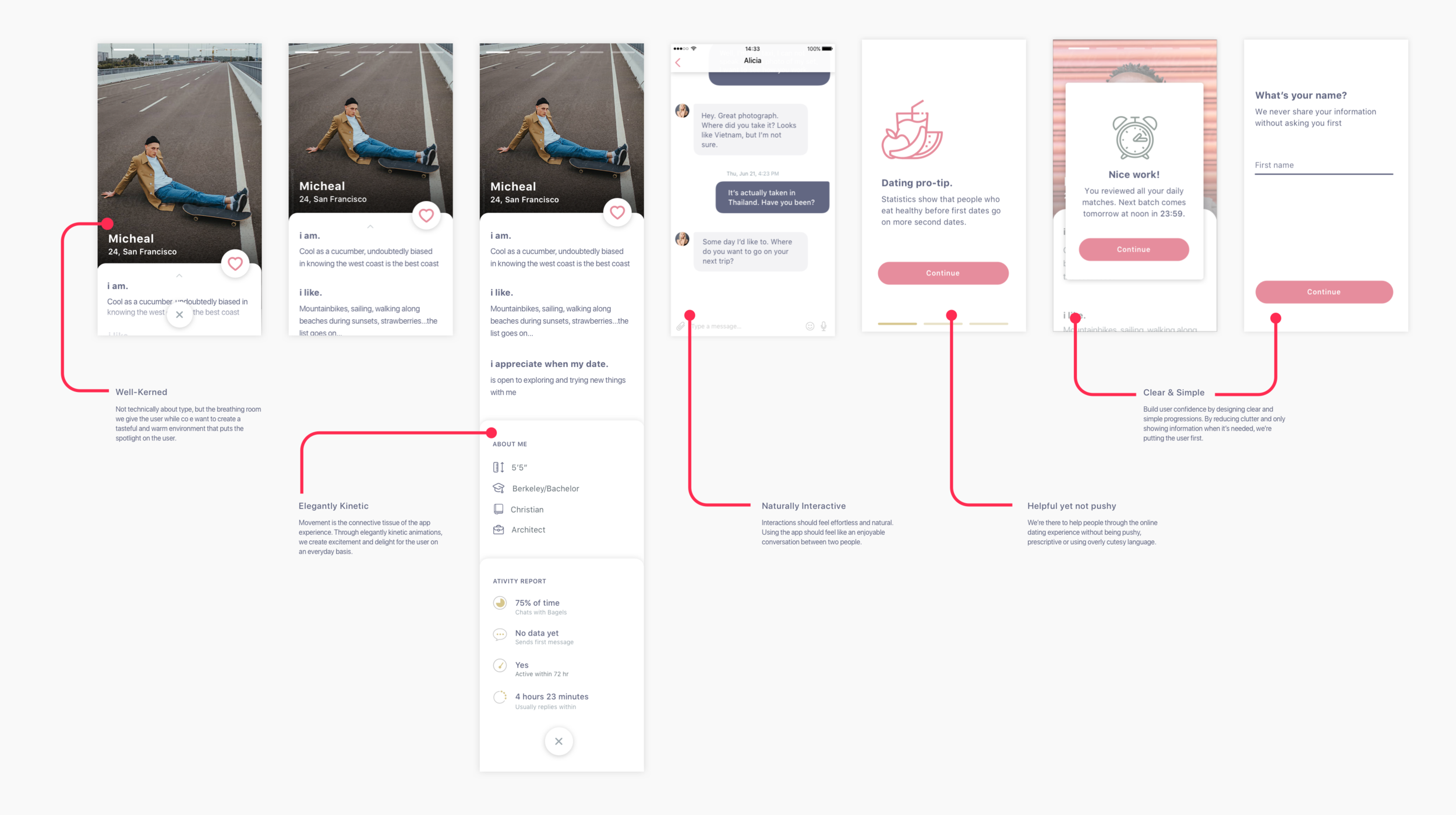
While we started with three distinct design directions, we eventually merged and omitted different elements from each direction. In this way we were able to distill the three directions into a single unique solution. We documented this final solution into something called an archetype, essentially a collection of key screens within the app that we redesigned with the new visual language.

From Exploration to Action
Using the final archetype, we then set out to create a component library. Basically, this is a guide for both designers and engineers to reference whenever a new feature is built. Over time this not only creates a consistent look and feel for any mobile experience, it speeds up design and implementation. In this way, having a strong design process doesn’t just ‘look pretty’, it benefits the entire product team.